I’ve been around the blogosphere for a while now, and I’ve noticed that the ol’ media empire here is starting to look a little dated. There’s a definite “pro” look these days, propagated by the templates available in the popular online blogging services. Some of the hallmarks of the pro look seem useful, like limited width so the eye can comfortably scan text. There’s also a feeling that all the parts are fit together into a nice, integrated, whole.
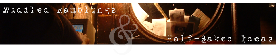
It made me think about what I would like this blog to look like. In the end, it still won’t have that pro look. The thing I most want to do will not work in Internet Explorer 6, and maybe not even 7. What I most want is an end to rectangles. The ampersand breaking out of its box in the header (unless you are using Crappy Browser 6) has had people asking me “how did you do that”? Making the top of the what’s new box not line up with the top of the sidebar was another somewhat tricky little bit of coding, just to break the lines.
What I’d really like to do is build on the “mad scientist” theme. I’ve got some thoughts on how to do that, but as usual my ambitions far outmatch my abilities. We’ll see, though. I might be able to pull off “slick, high-tech mad scientist”.
I’m curious what you guys like or don’t about the current design. Certainly the most important aspect is readability. That’s what it’s here for, after all.
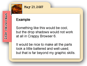
This isn’t quite what I was shooting for, but is does have visual appeal (and rounded bits).
