NOTE: Whoops! Here I thought I was helping out, but my call for submissions was actually after the deadline, and there’s plenty of good stuff on deck. Sorry about that.
I kept the original episode for posterity, but I’m adding descriptions of the upcoming issues, for those poetically and photographically inclined. If you’re inspired by the current theme, don’t let that stop you from writing about it.
The original episode:
The Editor-in-Chief of The Poetic Pinup Revue has informed me that she needs poetry and flash fiction. If you’re not familiar with the magazine, The Revue is a hefty, glossy magazine with awesome photography paired with sweet poetry in a way that words and images enhance each other.

The current Revue: Love, Lust, and Longing
Last issue, Harlean (who is a fiction) had a glut of poetry but had to beat the bushes for high-quality photos. This time around the photo department is doing well, but quality poetry that’s on-theme is needed.

Next up: The Mathematics of Imagination
The theme this issue is “The Mathematics of Imagination,” which, if you ask me, is pretty cool. These days creativity and technology are pals, but through history math has influenced art (see also, ‘vanishing point’).
I once co-wrote a poem that rhymed ‘carrot’, with ‘pi, r, and square it’, though credit for that rhyme goes to my co-author on that epic effort. (Actually, thinking back, it may be that Edgar Pildrot (who is a fiction) was responsible for the entire work. I get no credit, but you have to admit it’s a pretty sweet rhyme.) I have not submitted that work for the magazine, but it just goes to show that you can put math into poetry.
What inspires you? The curve of the nautilus shell? Whether she loves you or loves you not? What happens in the space between the pixels? Think about it. Write about it, and let us know.
Post-Whoops! addendum:
The time has already passed for mathemagical submissions, but if the above inspired you and you write about it you can always put it in the comments here. In the meantime, I encourage you to ponder the themes for upcoming issues:

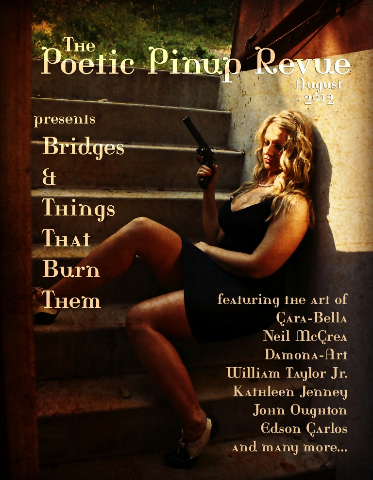
Bridges and Things that Burn Them
Bridges and Things that Burn Them. I really like this theme, I really like the cover, and the whole issue is shaping up to be a blockbuster. One more beer in me and I’m going to start writing something.

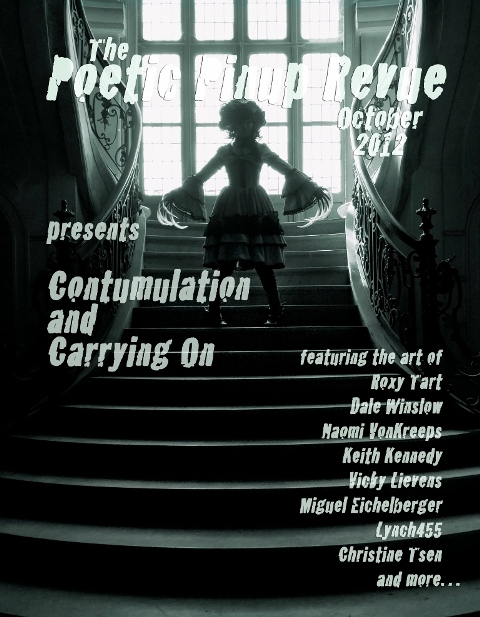
Contumulation & Carrying On
It’s all about
what comes after. I’ve seen some of the photos slated for this issue, and all I can say is, “dang”.
Sharing improves humanity: