This is the logo for the FIFA World cup:
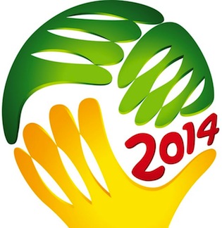
One of the F’s in FIFA stands for ‘football’, the more-descriptive name for the most popular sport in the world. It is the least hand-oriented sport I can think of.
Yet… look again at that logo. It’s made of hands! It looks like multiple people grabbing for the ball — something that never, ever, would happen in that game. It’s like using swim fins in a hockey logo. I’m sure the folks at FIFA had thousands of designs to choose from; surely one of them actually represented the game being played.

Apparently the goalies union got to design the logo.
Perhaps the Union of Three-Handed Goalies (and thus avoiding aprostrophical uncertainty).
Add a possessive apostrophe where appropriate.
I am very pro-snark, but I will point out that this is supposed to be multiple people hoisting the trophy (which, however, is not in any way a “Cup”, even though it is called that).
I did find a larger version that looks like it’s modeled after the trophy; the smaller one I show above is what flashes on TV screens during the matches.
Still, I’m pretty sure that part of the trophy is a ball, so this logo is a ball made of hands.
Hey, Bug, has the hospitality of your hosts changed since the Germany debacle?
Having now seen the trophy, I see that it is a globe at the top, rather than a ball. So, I must retract some of my snark, indeed. However, it still feels ‘handy’.
Just saw a television ad by FIFA saying “we’re trying to make our sport less corrupt.”