OK, so, I’ve been mucking around with a business card to give to people who are interested in my blog. It came time to try to print the dang things out, and I was a bit stumped. Microsoft Word has template files you can use to lay out a page, but I don’t have Word and really all I wanted was something where I could say, “Template 8371. Here’s my image. Go.”
I started by looking for a template someone has created for OpenOffice (you know it has to be out there), but I wasn’t getting results. I eventually went to Avery’s site, and searched for a template there, or the exact dimensions of the page if I had to make my own. I wasn’t having much luck when I saw something called “Print From the Web”. I signed up, told it the product number, and was thrown for a moment. I had to pick a pre-designed template. Finally I chose one, and on the next screen deleted everything in the template and added my image. Bing-bam, I had a PDF that exactly matches their paper. Except for not having a tabula rasa or single-image template, it could not have been simpler.
Good job, guys!
Unfortunately I seem to have a design that brings out the weaknesses of Ink Jet printers. Lots of light colors that require mixing in white – which is done by dithering the darker ink. Still, it’s better than nothing. There are probably printers that would do better, but to really get it done right, I guess I’d have to go to a professional shop. Not exactly in my price range for something as unimportant as this. Springing for the paper was my limit.
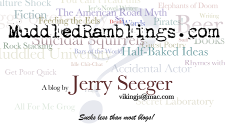
Here’s what I have right now. It’s funny how (at least with this printer) the MuddledRamblings.com stands out much more in print than on the screen. I had to boost up the background lettering quite a bit.

It’s a lot cleaner now, in it’s jumbled fashion. I just had to have a watermark so I used a question mark — not sure about that one. Then I just have to decide what email address to use (anythingnotalreadytaken@mac.com/), and I’m golden.
Here’s a list of the words in the background, roughly from top to bottom. Kids! See who can find them all first!
- Culture Shock
- You can’t read this
- Elephants of Doom
- Jer’s Novel Writer
- Fiction
- The American Road Myth
- Feeding the Eels
- Writing
- Eggs over-easy
- Sex
- Death
- Words
- Pirates!
- Beer
- Suicidal Squirrels
- Guest Poetry
- Stuff
- Books
- Rock Stacking
- Bars of the World
- Half-Baked Ideas
- Muddled University
- Idle Chit-Chat
- Rhymes with
- Accidental Actor
- Get Poor Quick
- Prague
- Secret Laboratory
- All For Me Grog


It’s hard to find a good question mark these days. That one is from a font called Zirkon. Most of the text is Baskerville, but their question mark really blows. Asian fonts had decent ones, but the dots are too big. Zirkon had a little added flair as well.
This episode came out in a few phases, and even the title changed on the second post. By the fourth post I figured out what was wrong with the html for the list (nothing). Sorry about any confusion.
Since posting that picture, I’ve decided that the MuddledRamblings.com should come down just a little bit. Of course, that will affect everything else.
I think I’m also going to take out the word blog and leave it “Sucks less than most!”
Visual impact of “Jerry Seeger: Sucks less than most” should get you lots of interest, to be sure.
To say the least.
But then that may be the selling point of the card…or not.
One Card if by day
Two for the revolution
After Three, nap time
I think the first card is much better. YOu got the full title of the Blog, the clutter gracefully settles to the bottom, and the “&” works better then the question mark. Of course, I just finished watching Beer Fest.
Of course, if you get to Albuquerque, you can see how that card comes out on a laser printer … it works well for the Rio Grande Sailing Club newsletter.
I do miss having the full blog name in there, but almost everyone just calls it Muddled Ramblings anyway. The current version is less top-heavy, but still not as balanced as I would like. On the other hand, the previous version seems too crowded, with three pieces of information instead of two.
(In the current design, “You can’t read this” moved down far enough that you can read it, so I changed it to “The Monster Within”.)
I tried “It sucks less than most!” for the tagline, but the capital I in all the marketing-script fonts I looked at aren’t very good to use as the lead in a block of text. I think you need to start with a character that doesn’t have alternate forms so your brain can calibrate to the rules of the font, before you throw tricky litters at it. Or something like that.
After I do my chores today, I’ll try a version with the two areas inverted. It’ll start with “A blog by…” which is a little odd grammatically, but I’m OK with that.
I think that “Half-Baked Ideas” could be connected to “muddledramblings.com” by being a bit more saturated. I also like having the bulk of things toward the bottom; on top the card feels to tippy and unstable.