Every once in a while someone asks me for a card, or they want to know the address of my blog, but neither of us have anything to write on. The people that ask for the blog address inevitably ask again later. I figure having a card to hand those people will help.
For the last couple of days I’ve been spending a bit of time poking around in Baby Photoshop, and I think I’ve just about hit the limits of my graphic design abilities, such as they are. Here’s what I’ve got:
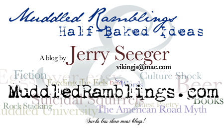
Obviously this image isn’t actual size, I made it bigger so you could see the words better at screen resolutions. I started with my name much smaller and over to the side, but then I made it stand out more so people who look at the card later will be more likely to remember where it came from.
Of course, I’ve spent way more time on this than I should have. The first step was searching for fonts. I don’t have the original photoshop file for the logo at the top of the blog, nor do I have the fonts. There are some excellent sites chock-full of really cool free fonts, but I couldn’t find two of the ones I had used originally. Oh, well. Then came a long process of shifting things around, tweaking color and transparency, letter spacing, and on and on.
Photoshop was a little annoying while I was working on this. When I saved and reopened the file most (not all) of the text layers were converted to bitmaps, which meant it was much more difficult to edit them. Perhaps I should have used The Gimp from the get-go. It has it’s own annoying features, but now I’m afraid to close the file in Photoshop for fear of more bitmap conversions.
So what do you think? I’d very much like to hear from anyone who has an opinion about this sort of thing. I’ll be test-printing today to make sure that the smaller text is easily legible. (The part at the bottom reads “Sucks less than most blogs!”) The background text has a couple of holes in it, as well. Any suggestions for short words or phrases that apply to MR&HBI that I could fill in with?

Yesterday, as I sat staring at this thing, I thought of how cool it would be to make into a Flash animation with the words flying onto the screen. Now that would be a real time-waster!
Squinting at the background, I don’t see “Bars of the World.”
I like the card all except for “Sucks less than most blogs!” at the bottom. Throws the whole design off balance, to me, and adds a font that doesn’t seem to fit with the rest.
How are you going to print this card, out of curiosity?
Well, it ain’t no “Paladin Have Gun, Will Travel”
but…say! actually its pretty good. Are you sure you’re not a graphic artist disguised as a Japanese anime guru disguised as a wandering bearded american?
Some other Jer themes for the background are get-poor-quick schemes and JNW engineer. Also eggs over easy. And Pirates!
Yeah, and will we be proud owners of our own set to hand out when buying coffee? (figure someone has to win those monthly drawings everywhere not like I want the committment of showing back up)
I liked the words Sucks less than most blogs but Aser’s right it sort of is off.
you should use composite modes so that when the words on other layers overlap you get different looks. Save your file as a Photoshop and it won’t flatten your layers(or rasterize type.) They say the first rule of graphic design is to reduce your image to greyscale and then make it big enough so you can see it from the other side of the room. So do that, go over there, and if you can read the important info without too much difficulty then you’re half way there. I see Beer pretty clearly, no mention of food in the traditional sense, but where the hells the SEX? I mean come on! I thought you wanted people to check out your blog. First rule of Graphic Design, put some boobies on it. Then double it.
Come on JM…the word “sucks” gave enough connotations without having to add the rack *grins wickedly*
Or did you miss that?
Looks nice, the only thing I can say, and this is a minor issue: chances are card scanning apps (www.cardscan.com for example) may have issues with it. A minor point, but it may frustrate business types with a lack of patience.
Come on McSweedish! Everyone does the boobie thing. What Jer needs is a giant pair of testicles in the BG. Grey scales those bastards, and you got something going on. Gotta thing outside the rack. Of course, you could have both…
Needs more Cowbell!
Agree with Aser on the “sucks” thing.
Where’s the Pirates!
/arg
well, I m a lone voice for likin the sucks less thing. But no matter. I realize I “get” all the faint sayings in the background, but realized that somebody completely unfamiliar withh thhe blog might be overwhelmed. If you can bounce the card idea off some stangers it might be your best feedback.
If the double hhs in words above bug folks, it’s because I’m on a new keyboard. It’s a Dell, and it is simply smaller in saiz e than my last keyboards. Causes me lots o mistypes. Somebody needs to stop the “Smaller is Better/ slimmer is better” juggernaut. I need a man’s size keyboard. And about these daggone cell phones…I puinch at the numbers like a gorrilla with bee-stung fingers. I’m gonna invent the “Man cell phone” – It’ll be the size of a good ol fashioned cradle phone handset and it’ll hang off your harley wallet chain.
Q: Whut’s a “stanger?”
A: A Mustang drivin’ hillbilly!
So what’s the difference between a violin and a fiddle?
A violin has strings; a fiddle has strangs.
I agree with the tall man with fat fingertips — the “sucks” bit is good. Well, appropriate. Well, the rest of the design is very good, so the “sucks” comment brings the uninitiated back to reality. Or at least prepares them for the quality of most of the comments.
Okay, a very few of the comments, since I rarely post.
guys, all im sayin, is if rock legend bruce dikinson wants more cowbell… i say we give him more cowbell!!
Man, there’s a lot of jerks around here. So, McSweedish, the thing is, I DID save it as a photoshop file, and it still rasterized my text. When I opened it back up it gave an error about missing text layer data. Happened a second time.
I think I won’t use testicles. I got a second opinion from my beer slave as well (it’s nice to have a beer slave), and she started talking to me about “rules of MarComm” and stuff like that. Apparently one of the first rules of marcomm is not to repeat stuff like “Muddled Ramblings”. She suggested removing the top portion and putting the URL up there instead. I’ve been messing with that, but nothing quite looks right.
Sex is in there, probably too small to make out on this screen graphic but right in the middle. It’s positioned to form a progression “Sex Death & Words”.
Eggs over-easy is very large and very faint. Get Poor Quick and Jer’s Novel writer should be in there; I’ll probably be able to work them in, especially if I lose the top portion, which as I typed those last words I figured out how to do. I’m gong to miss the big background ampersand, though. It really tied the card together. (The “sucks less…” is actually the same font as the &.) And no, I won’t be replacing it with testicles.
So how the hell can I move several photoshop layers all together?
Figured it out. New marcomm-friendly layout has potential, but it’s going to be a lot of work.
I’m a writer, I’m a drinker
I’m a mu uuuu ddled rambler
get ma stories on the ru uuu nnn