Little Café Near Home on a Wednesday night
fuego passed his old phone to me when he got a new one. Let me tell you, this puppy is pretty fancy. The other night I was at Little Café Near Home, trying to sort out all the features. One thing I did was take some pictures and email them to myself. Yep, my phone has wireless Internet. The Opera Mini browser works fairly well rendering Web pages on the little screen, and overall I’m pretty darn happy with it.
The phone has not one, but two cameras. As well as the main camera, which is pretty nice but the controls are a bit cumbersome, there is a secondary, lower-quality camera on the same side as the screen, whose only purpose, as far as I can tell, is self-portraits.
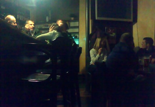
So here is a view of LCNH that I rather like, for reasons I can’t put my finger on. I am sitting at the far end of the place, so you can see that the the place really is quite small.

I’m not sure what it is that appeals to me so much about this picture, and it’s very sensitive to the brightness of your monitor to boot. When I get it adjusted for one monitor, it doesn’t look so good on the other. So it goes. I’m never quite satisfied wit the cropping, either.
Despite all that, I like it. In a way it feels like a Rembrandt, the way the light works, but there’s definitely a more modern feel as well, kind of like Edward Hopper’s “Night-Hawks” but from a riskier vantage point. The camera noise due to the low light gives it an impressionistic feeling.
Or maybe not.
Okay I was going to comment that and you did! Cool snap.
I think there is a more direct comparison with Rembrandt than with Hopper. Hopper’s too clean.
I love the way the light shows up on the faces of the guys at the bar, and the other little bits of light that show up here and there to empahsize something that would otherwise be an insignificant detail. That’s pure Rembrandt.
You’re right about it looking different on different monitors. On my laptop, just returned home after two weeks in the factory for warranty service, the picture looks much more Hopperish.
This picture seems particularly sensitive to that, though I’ve got others (mostly taken in low light) that are also tricky that way. It makes sense to me now why the pros have a thing they hold up to the screen to calibrate their monitors. The only trouble is, if they distribute digitally their clients won’t.
I think I pushed the slider in The Gimp (like photoshop but even more frustrating – and free) a little too far away from “Rembrandt” towards “Hopper”, but it looks perfect on one of my computers, anyway. Still, I like it a lot and there doesn’t seem to be any point in tweaking it until it’s perfect, since it won’t be perfect anywhere else.
I’m still figuring the GIMP out. But now the friendly librarian’s letting me know that it’s time to move on.
While I’m not enough of an art historian to comment on the genre of the shot, there is a lot about it which appeals to me. I love the lighting contrast of the two groups, emphasized by the strong vertical lines in the center; I enjoy the balanced contrast between the rich wood of the chair and the sterile, darkened screen of the television; I love that the only hint of action in the center is blurred and ambiguous, while still being intimate; but most of all, I love that the only thing in crisp focus is the dark, empty chair in the foreground.
I know that little or none of this is by design, but inadvertent as it may have been, it’s art. The piece is very evocative, and (well, obviously) I’ve stared at it for a long time in contented contemplation.
:)
Left half, Rembrandt. The light, the faces.
Right half, Hopper. The shadows, the angles.