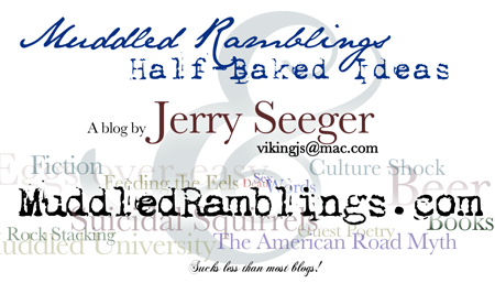
Every once in a while someone asks me for a card, or they want to know the address of my blog, but neither of us have anything to write on. The people that ask for the blog address inevitably ask again later. I figure having a card to hand those people will help.
For the last couple of days I’ve been spending a bit of time poking around in Baby Photoshop, and I think I’ve just about hit the limits of my graphic design abilities, such as they are. Here’s what I’ve got:

Obviously this image isn’t actual size, I made it bigger so you could see the words better at screen resolutions. I started with my name much smaller and over to the side, but then I made it stand out more so people who look at the card later will be more likely to remember where it came from.
Of course, I’ve spent way more time on this than I should have. The first step was searching for fonts. I don’t have the original photoshop file for the logo at the top of the blog, nor do I have the fonts. There are some excellent sites chock-full of really cool free fonts, but I couldn’t find two of the ones I had used originally. Oh, well. Then came a long process of shifting things around, tweaking color and transparency, letter spacing, and on and on.
Photoshop was a little annoying while I was working on this. When I saved and reopened the file most (not all) of the text layers were converted to bitmaps, which meant it was much more difficult to edit them. Perhaps I should have used The Gimp from the get-go. It has it’s own annoying features, but now I’m afraid to close the file in Photoshop for fear of more bitmap conversions.
So what do you think? I’d very much like to hear from anyone who has an opinion about this sort of thing. I’ll be test-printing today to make sure that the smaller text is easily legible. (The part at the bottom reads “Sucks less than most blogs!”) The background text has a couple of holes in it, as well. Any suggestions for short words or phrases that apply to MR&HBI that I could fill in with?

